
Have you ever found yourself grappling with an overwhelming dataset, wishing for a straightforward way to spotlight the most significant insights? Imagine sifting through myriad figures and data points, seeking clarity, yet becoming burdened by the sheer volume of information. The challenge lies not only in understanding the data but also in illustrating it effectively. In the fast-paced environments of data analytics, how can one swiftly highlight the ‘Top 10’ data points in both Pivot Tables and Tableau? This guide showcases essential hacks to elevate your data visualization game, presenting actionable techniques to highlight your key findings.
Before delving into solutions, it’s crucial to comprehend the common pitfalls encountered while working with large datasets. Overloading a spreadsheet can lead to confusion and misinterpretation. Data analysts must strive to translate complex matrices into simple, digestible visualizations. The brilliance of both Pivot Tables and Tableau lies in their ability to pivot vast amounts of data into actionable insights. Let’s embark on an enlightening journey to explore enhancing your analytical prowess.
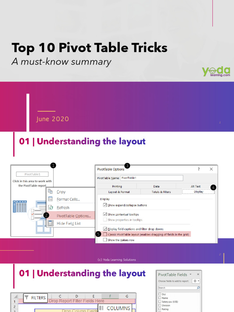
1. Mastering Pivot Tables: The Foundation
At the very core, understanding how to leverage Pivot Tables in software like Microsoft Excel is paramount. These tables allow you to summarize vast datasets succinctly. Start by selecting your data, navigating to the Insert tab, and choosing the Pivot Table option. This cornerstone lays the groundwork for your analysis.
2. Sorting for Clarity
Once your Pivot Table is established, sorting your data can drastically improve clarity. Utilize the sorting features to organize your data points in descending order, ensuring that the most relevant figures emerge at the top. This method invites quick scanning and seamless interpretation among stakeholders.
3. Filtering: A Dynamic Approach
Filters are akin to a refined lens to focus on specific aspects of your data. In the Pivot Table, apply value filters to isolate the top 10 entries of interest. This feature not only streamlines your analysis but encourages well-informed decision-making. With a robust filter in place, the essential data stands out, transforming chaos into clarity.
4. Calculated Fields: Customizing Insights
Calculated fields enable analysts to create bespoke metrics tailored to unique business needs. By integrating functions like SUM, AVERAGE, or COUNT into your Pivot Table, you can derive customized insights. This level of personalization transforms your table from a static display into a dynamic, insightful resource for analysis.
5. Incorporating Charts for Visualization
No data presentation is complete without generous doses of visualization. Once the top 10 metrics are identified, harness the power of Excel Charts to depict these insights graphically. Whether through pie charts, bar graphs, or line charts, visual representation will energize your findings and resonate more profoundly with your audience.
6. Transitioning to Tableau: A Visual Masterpiece
While Pivot Tables serve data crunching excellently, Tableau takes data visualization to unprecedented heights. Transitioning from Excel to Tableau opens up a world of creative opportunities. After importing your dataset into Tableau, you’ll embark on an exciting journey of visual storytelling.
7. Utilizing Smart Filters
Tableau’s filtering capabilities surpass traditional spreadsheet methods. Use the Top N filter options to extract and display your top 10 values effortlessly. This feature empowers you to cultivate a focused visual narrative, catering directly to your audience’s interests. The transformation from raw data to curated insights becomes seamless and compelling.
8. Customizing Views with Dashboards
Dashboards unleash the full potential of your findings in Tableau. By amalgamating multiple visualizations into a single interface, users can appreciate the holistic view of the data landscape. Design your dashboard to highlight your top 10 insights prominently, ensuring they capture the audience’s attention immediately—creating an engaging tableau of information.
9. Leveraging Parameters for Flexibility
Parameters in Tableau permit users to introduce an interactive element to their analyses. Create a parameter that allows viewers to adjust the threshold of the data points displayed. By enabling this interactivity, you convert passive observers into active participants, enticing them to explore various angles of the dataset and discover hidden gems.
10. Showcasing with Animations
To ratchet up the engagement level, consider employing animated transitions within Tableau. Animated visuals can breathe life into static content, guiding viewers through the evolution of your top 10 insights. Utilizing smooth transitions not only captivates your audience but also reinforces the narrative you’re aiming to present.
In conclusion, the art of showcasing top data points, whether within Pivot Tables or Tableau, requires both technical acumen and creative flair. The tools are only as effective as the methodologies employed in harnessing their full potential. Embracing the outlined strategies can eliminate the clutter often associated with data analysis, presenting a clarity that is both comprehensible and compelling. With these pro hacks at your disposal, you’ll not only rise above challenges but also emerge as a trusted advisor in the realm of data-informed decision-making. Ready to elevate your analytical prowess? The opportunity to transform your data storytelling awaits!


Leave a Comment