
In the vast ocean of data, where numbers swirl and trends drift like currents, learning how to extract meaningful insights can feel akin to navigating through treacherous waters. Fortunately, with Excel’s Pivot Tables, charting a course toward clarity and comprehension becomes remarkably feasible. Among the most enlightening capabilities of Pivot Tables is the ability to showcase the top contenders—those singular pieces of data that stand out like vibrant fish in a monochromatic sea. Below are ten comprehensive strategies to effectively highlight these top entries in your Pivot Tables.
1. Understanding the Basics of Pivot Tables
Before delving into the intricate machinations of displaying top entries, it’s pivotal to grasp the foundational concepts of Pivot Tables. Think of a Pivot Table as your personal data symphony conductor, orchestrating an array of information into a cohesive composition. The abilities of sorting, filtering, and summarizing data allow you to crystallize complex datasets into coherent narratives, making the evaluation of top entries not just insightful, but also visually appealing.
2. Creating the Pivot Table
To commence your journey, begin by selecting your data range. Navigate to the “Insert” tab and opt for “PivotTable.” A dialogue box will appear, asking for the data source and the location for your new Pivot Table—either in a new or existing worksheet. Like laying the foundation of a grand structure, this initial step is crucial for your upcoming architectural triumph.
3. Incorporating Fields into the Pivot Table
Once your Pivot Table is born, it’s time to populate it with data by dragging fields into the “Rows,” “Columns,” and “Values” areas. Consider this act akin to assembling a jigsaw puzzle; each piece must fit harmoniously to reveal the larger picture. Depending on your analysis objectives, choose wisely which categories (dimensions) and numerical values (metrics) will best illustrate the insights you seek.
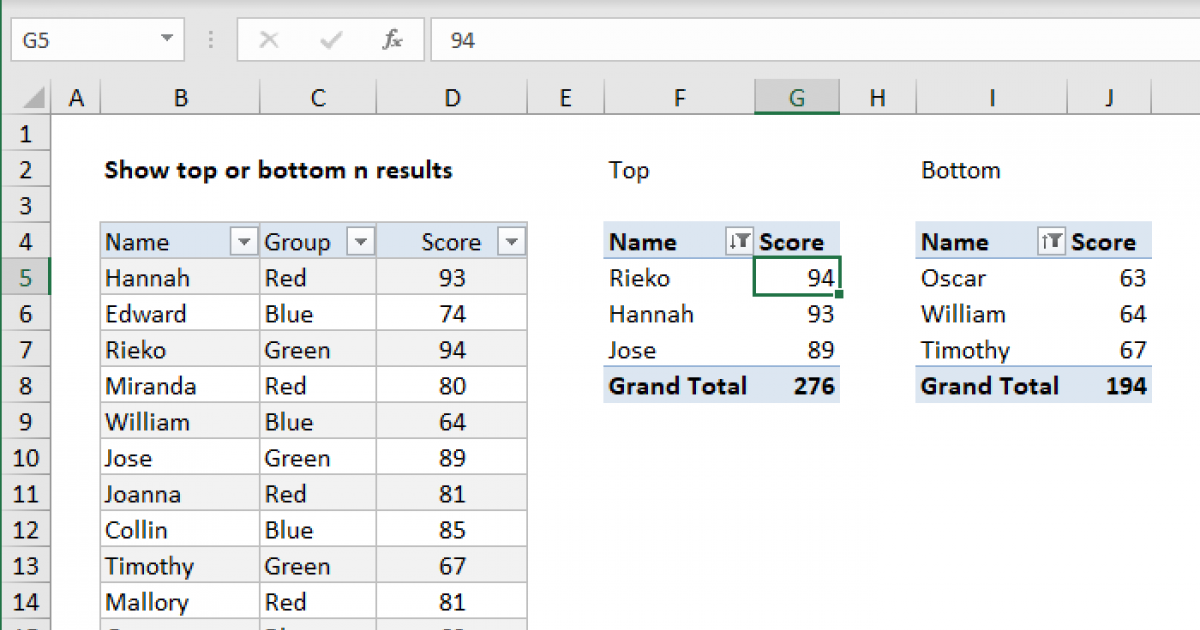
4. Applying Value Filters to Spotlight the Top Entries
As you sculpt your Pivot Table, applying value filters can be your secret weapon in illuminating top entries. By clicking the drop-down menu of the value field, you can select “Value Filters” and then choose “Top 10.” This function acts as a lighthouse, directing your gaze toward the top performers in your dataset. You may even customize this function by specifying parameters—perhaps you want the top 5 or top 20 entries instead.
5. Utilizing the ‘Top 10’ Command
Within the value filter menu lies the powerful “Top 10” command. Leverage this option to filter your data dynamically, dramatically reducing the clutter and concentrating on what matters most. By visually isolating the crème de la crème, you can facilitate focused discussions and decisions, much like a connoisseur narrowing down their selection to the finest wines.
6. Creating a Top 10 List with Slicers
To elevate interactivity, consider employing Slicers. These are graphic elements that provide an intuitive interface for filtering data. Like a well-designed tool kit that simplifies a craftsman’s work, Slicers bring a level of accessibility to your Pivot Table. Incorporating slicers allows users to seamlessly explore various dimensions while still maintaining the focus on the top entries, enhancing user engagement.
7. Formatting for Visual Impact
Once you have your top entries highlighted, it’s time to enhance visual appeal through formatting. Use color coding, bold fonts, and conditional formatting to create a tableau that draws the eye. Well-placed aesthetics are akin to a painter’s brushstrokes on a canvas; they hold the power to evoke emotions and facilitate understanding, thereby making the top entrants even more compelling.
8. Leveraging Charts to Illustrate Top Performers
Transform your data narrative further by integrating charts that graphically represent your Pivot Table’s top entries. Utilize bar charts or pie charts to provide a visual summary that encapsulates relationships among values. This method acts as a vibrant canvas against which the intricate dance of your data can be beautifully displayed, allowing for instantaneous comprehension.
9. Explaining the Context of Top Entries
Every number has a story, and it is crucial to provide context for your top entries. Accompany your findings with succinct interpretations or analytical narratives explaining why certain entries may perform better than others. This narrative serves as a guiding compass, allowing stakeholders to embark on enlightened discussions based on statistical evidence, rather than mere conjecture.
10. Experiment and Analyze
Finally, the beauty of Excel Pivot Tables lies in their flexibility. Don’t hesitate to experiment with different configurations. Vary the fields, modify the filters, and analyze the implications. This process is reminiscent of a seasoned explorer prowling through uncharted territories, constantly adapting to unveil new treasures hidden within the data landscape. Embrace this iterative journey, for each exploration may yield a fresh perspective on the top performers of your dataset.
In conclusion, showcasing top entries in Excel Pivot Tables transforms raw data into a golden thread of insights that weave narratives. Mastering the art of Pivot Tables not only provides clarity in decision-making but also breathes life into the dry statistics that govern business landscapes. With each method discussed, you are now equipped to navigate this phenomenon like an adept captain sailing toward the promising horizon of data literacy.


Leave a Comment