
In the vast landscape of data, the ability to distill vast arrays of information into concise and actionable insights is a coveted skill. Filtering data to showcase the top 10 entries across various platforms like Excel, Pivot Tables, Tableau, and Power BI not only sharpens analytical prowess but also initiates a shift in perspective regarding data representation. Here’s an extensive guide that delves into the nuances of this process across different tools.
1. Excel: The Ubiquitous Spreadsheet Tool
Excel is often the go-to tool for data analysis. Its functionality allows users to filter rows effortlessly while simultaneously retaining the integrity of the dataset.
To filter the top 10 values in Excel, start by selecting your data range. Navigate to the “Data” tab and click on “Filter” to enable the feature. A small drop-down arrow appears in your column headers. Click on the arrow of the specific column you wish to filter.
In the drop-down menu, locate “Number Filters” and select “Top 10…” A dialog box will appear where you can customize your selection. You can opt for showing the top 10 by value, percentage, or above/below a certain number. Here, you have the luxury of adjusting parameters to display only the most significant data points, allowing clarity amidst complexity.
2. Pivot Tables: Summarizing with Precision
Pivot tables revolutionize data synthesis, tallying figures and presenting them in a succinct format. To display the top 10 items using Pivot Tables, commence by creating a Pivot Table from your dataset. Drag the relevant field into the “Rows” area and the value field into the “Values” area.
Next, click on the drop-down arrow next to the row labels. Utilize “Value Filters” and select “Top 10…”. A dialog box pops up where you can specify your selection criteria. This ensures that you’re not merely looking at numbers but instead focusing on the crème de la crème that truly matters for your analysis.
3. Tableau: Visual Data Storytelling
When it comes to visualization, Tableau reigns supreme. This powerful tool transforms raw data into captivating visual narratives. To filter your dataset for the top 10 entries, drag your desired dimension into the “Rows” shelf and the measure into the “Columns” shelf.
Next, right-click on the dimension in the “Rows” shelf. Here, select “Filter” and navigate to the “Top” tab. Choose “By field” and input the top 10 criteria you desire. This allows you to manipulate data visually, enabling a profound insight into trends that might otherwise remain obscured.
To further enhance visualization, consider using the “Show Filters” option on the dashboard to allow users to interact dynamically with top selections. This interactive feature not only engages the audience but encourages exploration beyond static numbers.
4. Power BI: Harnessing Interactive Reporting
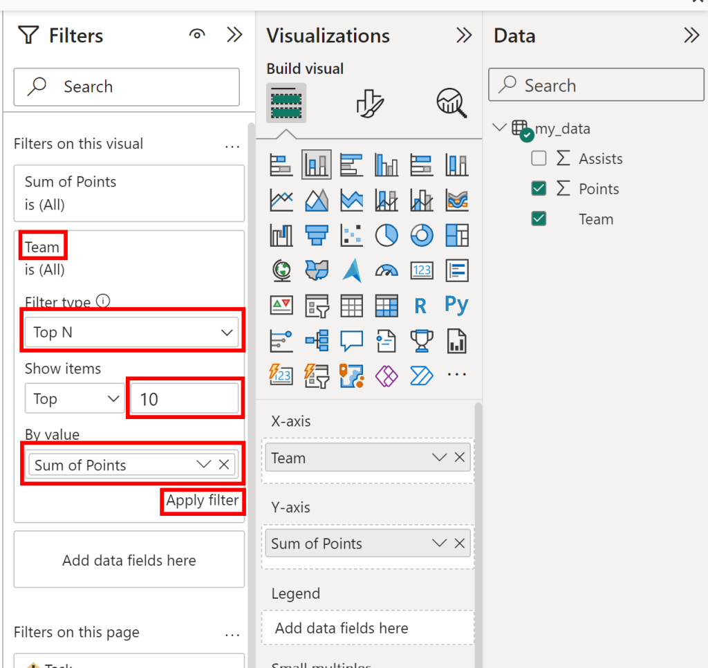
Power BI is increasingly favored for its rich interactive capabilities and stunning dashboards. To filter for the top 10 values in this sophisticated tool, start by selecting the visual you wish to edit. In the fields pane, use a measure to reflect a specific value.
Proceed to the “Visualizations” pane, and navigate to the “Filters” section. Here, drag the same measure to the filter area. You can specify top values by selecting “Top N” and entering the desired number. This simplifies the dataset, bringing focus to the most critical components and thus shaping data-driven decisions more effectively.
5. The Importance of Contextual Awareness
Regardless of the tool at hand, context is king. After filtering and displaying your top 10 items, it’s crucial to consider factors such as timeframe and relevance. For instance, are you looking at trends over months, or is it for a specific fiscal year? Understanding the landscape aids in discerning more profound insights and crafting actionable strategies.
6. Displaying Insights: Visualization Matters
Post-filtering, the presentation of your data is as pertinent as the data itself. Each platform offers unique visualization capabilities to enhance your displayed data. Choose graphs, charts, or tables that best illustrate your top 10 findings. In Excel, consider bar charts or pie charts. Tableau offers a vast array of visualizations—choose ones that align with the narrative you wish to tell. In Power BI, vibrant visuals can breathe life into traditional metrics.
7. Exploration and Iteration: The Key to Engagement
Once you’ve presented your top 10 insights, don’t merely stop there. Engage with your data iteratively. Dive deeper into each entry, explore relationships, and examine outliers. Both Tableau and Power BI facilitate drill-down functionalities, allowing for an enriched exploratory experience. Each click can lead to new revelations, shaping your strategy and decision-making process.
8. Concluding Thoughts: A Shift in Perspective
Filtering to showcase the top 10 in Excel, Pivot Tables, Tableau, or Power BI embodies more than just a technical maneuver. It’s an invitation to reevaluate the data, compelling individuals and organizations to focus on the most impactful insights. By wielding these tools adeptly, one can transform mundane data sets into visually striking and operationally significant narratives, steering toward informed decision-making. Such a shift promises not just clarity but a new appreciation for the nuances embedded within the numbers.


Leave a Comment