
Have you ever pondered how to elegantly present your top-performing data points in Tableau, yet found yourself submerged in a sea of mediocre visualizations? This article is designed to invigorate your data storytelling with a practical toolkit featuring hacks that can elevate your Tableau dashboards to the elite status they deserve. Embrace a newfound proficiency as we delve into the nuanced methods for displaying the top 10 data points effectively.
Before we embark on this journey, consider the challenge that often plagues data aficionados: How to capture attention and impart insight without overwhelming your audience. The answer lies in the art of simplicity combined with a touch of creativity. Below are ten ingenious hacks designed specifically for professionals looking to sharpen their Tableau display prowess.
1. Set the Stage with Filter Actions
Enhancing interactivity is paramount when presenting the top 10 data points. Utilizing filter actions, you can craft an immersive experience where clicking on a particular segment dynamically updates the visualization. This technique not only engages your audience, but it also allows them to explore insights in a fluid manner, creating an impression of interconnectedness within the data.
2. Use Sets for Dynamic Top N Calculations
Create a set that automatically updates based on your data selections. By incorporating a calculated field, you can easily filter out the top performers according to various metrics. This dynamic capability enables a bespoke analysis that adapts in real-time, ensuring that your visualizations are perpetually relevant and insightful.
3. Employ Parameter Controls for Flexibility
Parameters are an often-underutilized feature in Tableau, yet they can significantly enhance your data visualization. By allowing users to toggle between different metrics—sales, profit, or growth rate—you provide flexibility in their exploration of the data. Crafting a parameter control that seamlessly integrates into your dashboard can turn a static visual into a customizable experience.
4. Prioritize Color and Format Strategically
Color is not merely aesthetic; it’s an influential aspect of data interpretation. Employ contrasting colors to highlight the top 10 data points distinctly. Utilizing Tableau’s formatting options, such as bolding or varying sizes, can create a hierarchy that guides the viewer’s eye towards the most critical aspects of your data. Your visual should not only tell a story but also evoke emotion and response.
5. Harness the Power of Viz Animations
Animations can transform a data presentation from static to dynamic. Tableau supports smooth transitions and animations that illustrate changes over time. By employing this feature wisely, you can enhance your storytelling: revealing insights gradually, maintaining your audience’s engagement, and expounding upon the narrative of the data’s evolution.
6. Create Dual-Axis Charts for Comparative Viewing
A dual-axis chart allows for the juxtaposition of two different measures on a single graph, facilitating a more comprehensive understanding of how disparate factors interact. For instance, displaying sales figures alongside customer satisfaction ratings provides a clearer depiction of the relationship between performance and experience. This depth fosters critical thinking and analysis among your stakeholders.
7. Integrate Tooltip Customization for Deeper Insights
Tooltips are often overlooked features that can deliver profound insights without cluttering the visual space. You can customize tooltips to unveil additional details about each data point when hovered over. Utilize this feature to display relevant, supplementary data that enriches the primary insights depicted in your visualization.
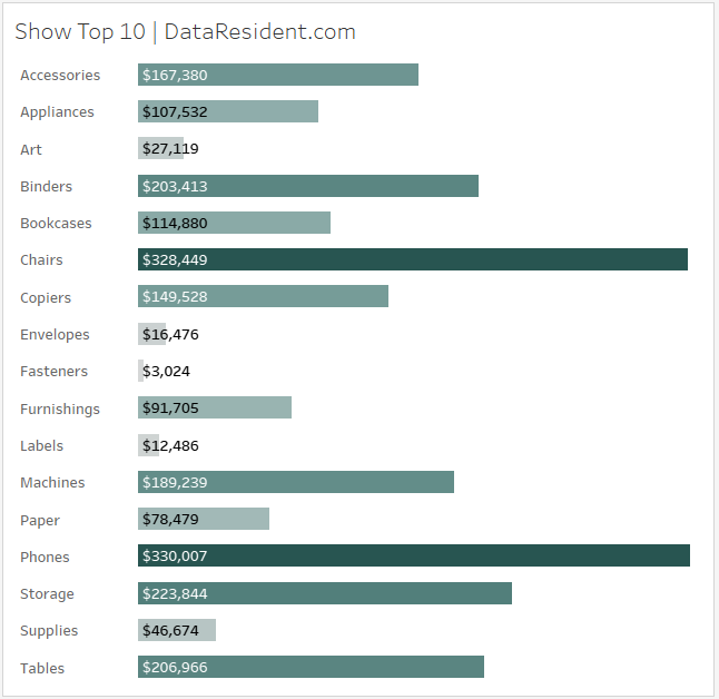
8. Simplify with Top N Filters
Displaying the top 10 is not merely a matter of selecting a “Top N” option; it requires precision and intentionality. Applying filters directly onto your view will allow you to narrow down the data effectively, focusing solely on the most pertinent figures. This purposeful filtering enhances clarity, making it easier for your audience to grasp the key takeaways at a glance.
9. Leverage Dashboard Actions for Cohesive User Experience
Creating a coherent narrative across multiple sheets or dashboards can be streamlined with the use of dashboard actions. By enabling users to click on the top 10 items to reveal detailed breakdowns in other sections of your dashboard, you promote an interactive narrative that captivates your audience. Actions that lead to more profound data exploration yield richer insights and user satisfaction.
10. End with a Summary Table
While visualizations are powerful, never underestimate the impact of a well-structured summary table. Conclusively presenting the top 10 data points alongside essential metrics provides a point of reference that solidifies understanding. This table acts as an anchor that your audience can return to, ensuring they walk away with clarity and actionable insights in mind.
In conclusion, mastering the display of your top 10 data points in Tableau is an endeavor that far exceeds the act of mere representation. By harnessing these ten hacks, you not only strengthen your dashboard’s visual fidelity but also engage your audience intellectually. With creativity and tactical acumen, transcending the challenges of data visualization becomes not just achievable but also tremendously rewarding. So, are you ready to elevate your Tableau experience and leave your audience in awe?


Leave a Comment