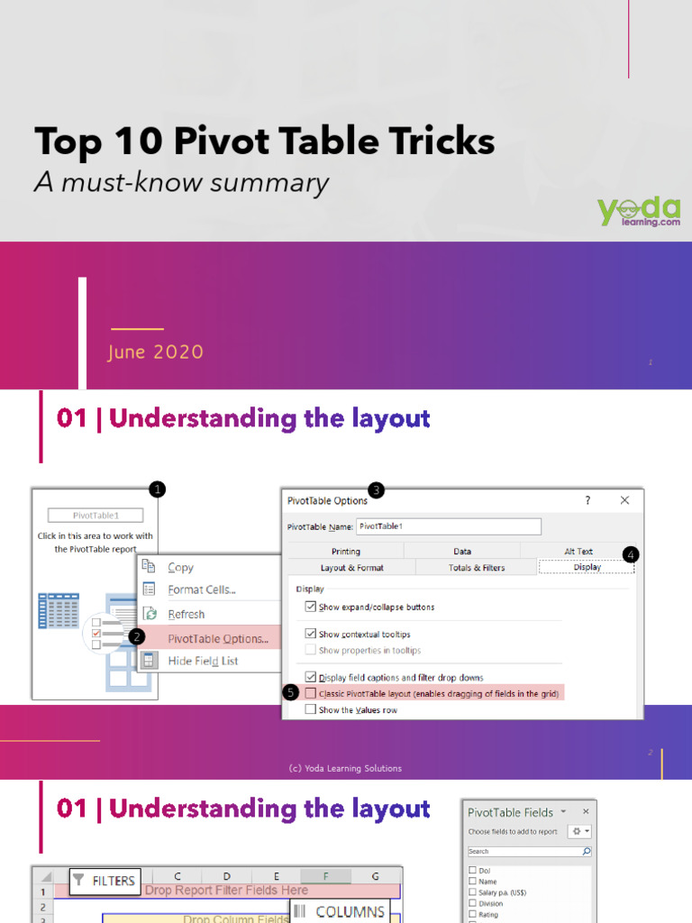
Pivot tables are among the most powerful features in Excel, transforming the way users analyze and present data. These versatile tools offer a myriad of functionalities that can streamline reporting, enhance data comprehension, and facilitate decision-making. Whether you are a novice or an experienced Excel user, mastering certain pivot table tricks can significantly elevate your data analysis skills. Here, we delve into the top ten pivot table tricks that every Excel user should be familiar with, ensuring you unlock the full potential of this indispensable feature.
1. Consolidate Data from Multiple Sources
Excel allows you to powerfully amalgamate data from varied sources into a single pivot table. By incorporating data from multiple worksheets or even different workbooks, you can gain a comprehensive view of your information landscape. This is especially useful for businesses operating across different departments or locations. To achieve this, simply select your data range and follow the wizard to collect data from disparate sources, making your pivot table a center for consolidated analysis.
2. Group Data Intelligently
Grouping is an often-underutilized aspect of pivot tables. By clustering similar data points, such as dates or categories, users can derive insights more efficiently. For example, when working with sales data, grouping by month or quarter can reveal seasonal trends that might be obscured in raw data. To group data, right-click on a row or column in the pivot table and select ‘Group’. This intuitive method simplifies analysis and enhances overall data clarity.
3. Implement Calculated Fields
Calculated fields enrich pivot tables by allowing users to create custom metrics on-the-fly. Instead of manipulating source data, simply introduce a calculated field that encapsulates your specific needs. For instance, in a sales report, you can create a calculated field to derive profit margins or sales growth percentages. By navigating to the ‘Fields, Items & Sets’ option under the ‘PivotTable Analyze’ tab, you can install these fields directly into your report, giving you enhanced analytical capabilities.
4. Utilize Slicers for Enhanced Filtering
Slicers serve as a dynamic and visual filtering option, elevating the user experience by allowing users to interactively segment their data. Unlike traditional dropdown filters, slicers provide a more visually intuitive way of navigating information. By adding slicers to your pivot table, you can filter data with just a click, making presentations more engaging and insightful. To insert slicers, navigate to the ‘Insert Slicer’ option in the PivotTable Analyze tab, and select the desired fields for slicing.
5. Create Pivot Charts for Visual Insights
Complementing pivot tables with pivot charts offers a robust visual representation of your data analysis. This synergy enables you to portray trends, comparisons, and metrics in a graphical format that is often easier to digest than raw numbers. After setting up your pivot table, simply select ‘PivotChart’ from the options, allowing you to visualize critical data points and drive informed decision-making more effectively.
6. Utilize the Show Values As Feature
This feature showcases data in various ways, providing deeper insights into data relationships. By right-clicking on a value field and selecting ‘Show Values As’, users can choose from diverse options such as running total, percentage of total, or difference from previous. This flexibility allows for more significant data interpretation, letting users view metrics in formats that best suit their analytical needs. Practice utilizing this feature to enhance your reports substantially.
7. Refresh Pivot Tables with Ease
As your source data changes, so should your pivot table. Knowing how to refresh your pivot table is paramount to maintaining data accuracy and relevance. By simply right-clicking on the pivot table and selecting ‘Refresh’, you’ll instantly update the relevant information. This capability ensures that your analyses reflect the most current data, helping prevent misguided conclusions drawn from stale information.
8. Create a Dynamic Named Range
Using dynamic named ranges for your pivot table source data can significantly enhance the table’s adaptability. By employing the OFFSET and COUNTA functions, a named range can automatically expand to include new data as it’s added. This technique safeguards against the need to constantly adjust your pivot table’s source range every time you upload new data, streamlining the process and facilitating continuous reporting.
9. Sort Data Strategically
Sorting can take your pivot table from ordinary to exceptional. By strategically organizing data, you can emphasize key metrics or trends that might otherwise go unnoticed. Right-click on a row or column label, and select the sorting option that fits your needs, whether ascending or descending. This not only simplifies your analysis but also enhances the narrative you deliver through your data.
10. Protect Your Pivot Tables
As you finalize and present your pivot tables, safeguarding them from unintended alterations becomes crucial. Excel provides options to protect your worksheets, allowing users to restrict editing or prevent unauthorized changes. By navigating to the ‘Review’ tab and selecting ‘Protect Sheet’, you can establish parameters to maintain data integrity while still sharing your work with colleagues.
In conclusion, mastering these top ten pivot table tricks equips Excel users with the necessary tools to elevate their data analysis and reporting capabilities. By integrating these techniques into your workflow, you can transform raw data into invaluable insights, enhancing your decision-making processes tremendously. As you continue to explore the myriad functionalities of pivot tables, remember that innovation in your approach to data can yield powerful business intelligence and drive success.


Leave a Comment